-
How to critique a painting:1. Description - Not what you think but what you see (elements)Line Shape Value Texture Color Space2. Analysis - Composition (principles)Balance Rhythm Emphasis Contrast Pattern Movement Unity3. Interpretation - what you feel the art work is saying (mood)4. Judgment - success of piece (craftsmanship, use of elements and principles, mood/feeling, define the strong areas, improvement needed?)
 Sample of a Critique written about this painting
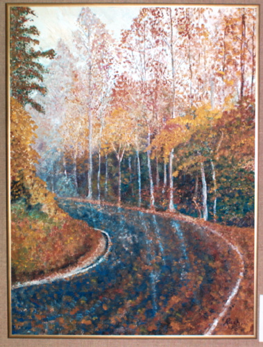
This critique is analyzing a visual work of art, that is a painting titled Roadside Vision. The work was created by Virginia Rash, who is from Independence, Kansas. The painting hangs in the hallway of the Fine Arts Building on the campus of Independence Community College in Independence, Kansas. The display area is appropriate for the work because the wall in a off white brick and the area is well lit. The painting is 24 inches tall by 18 inches wide and framed with a 1/2 inches gold metal frame. The golden color of the fram is repeated throughout the painting.
The landscape painting was painted with acrylic paint on a ground that is a board with canvas stretched over it. Very little sky shows in this vertical painting. The sky is very light and applied very thin. A road winds to the left and is painted with heavy dark paint. The distant trees reflect onto the wet looking road, created with glazing by adding medium to the acrylic paint. The medium is the vehicle that helped the artist spread on the paint. The fall leaves on the trees are painted with a dabbing brush stroke. Impasto is created in the leaves and heavy foliage on the lower left. Scubbling creates the texture of the leaves on the ground.
The composition of the painting shows a lot of unity because of the repeated use of the warm colors. The dominant analogous color scheme of red, yellow and orange ties the painting together. The contrast in the work is seen because of the dark value of the road that contrasts with the light value of the fall foliage. The movement in this work leads you around the bend where the road curves. This movement happens because of the deep space that leads the eye there as a result of the diagonal lines along the curving edge of the road; the overlapping of the plants; then the road and then the background tree; and because the value gets lighter at the back of the road. The emphasis in the painting is the dark large organic shape of the road. This shape stands out because of the vertical white lines of the tree trunks that point to it and are reflected into it. The repetition of organic shapes is dominant throughout the painting. From the small leaves, to the masses of tree leaves to the larger organic shapes of the road, this painting is dominated by organic shapes. The asymmetrical balance is created with the large form of the road that is balanced on the right with the smaller bright trees on the left.
The painting is an abstract work of art because the landscape subject is evident but the brushstrokes and simplification of the tree leaves make is not look completely real. The piece was done in 1998 and is created in the style of Impressionism. The Impressionism can be seen because of the quick dabbling brushstrokes especially in the leaves that have fallen on the road, the special lighting the comes in from the back of the road and because of the cool colors that are painting in the shadow and dark areas of the trees.
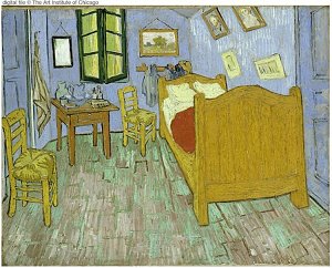
The painting is very pleasant to look at. It has a lot of structure because of the vertical lines of the tree trunks but a calm, peaceful feeling comes from the curving more horizontal line of the road. The unifying warm colors make me feel very comfortable especially since the fall is my favorite season of the year.____________________________________________________________________________________ The painting "Bedroom in Arles" by Vincent Van Gogh is an expressionistic piece which shows a very strong use of line and texture. The paint has been applied very thick, most likely with a pallet knife, in order to create the textured effect. The colors are vibrant and create a bright and happy mood in the room. The use of space in this image is very interesting. The perspective is slightly inaccurate. In real life the paintings would fall off the walls and you would most likely slip right out of the chairs if you sat on them. The expressionistic quality of the piece as a whole allows for the "crazy" perspective and the piece remains successful. The dominant element in this piece is the bed, it is the largest object and the bright red blanket is in contrast with the rest of the colors in the pallet. As you view the piece, your eye is lead around from the bed up to the paintings on the wall. From there you are lead to the back wall and window, down to the table and smaller chair, and than to the larger chair in the foreground. The piece itself is asymmetrically balanced with the large bed on the right and the smaller elements on the left. The feeling created by this painting is childlike, however it still holds some sophistication.Images from the study guide:
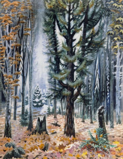
 Charles E. Burchfield (1893-1967), Hemlock in November, 1947-66; watercolor on paper, 42 x 32 1/2 inches
Select a School...

